Shell UX critique: navigation model, card switcher, and shell coherence — 25 September 2026
Requested directly by the operator: “did we ever get good feedback on our design? … i don’t think we’ve really thought through the shell ux particularly well … we need to make it better.” Three examples were named explicitly and are addressed by name below: the card switcher shows one card at a time, there are no icons on the cards, and swiping up from the bottom of Settings does nothing.
0. Relationship to other reviews — read this first
This repository already carries a lot of design material, and this document does not replace any of it. It is a fourth document in a set that should be read together:
docs/design/handheld-shell/(README.md,transitions.md,motion-research.md) — the original planning artifacts for a gesture shell, written before most of it was built. Large parts of what this critique flags as “missing” are things these documents already called for.docs/design/handheld-shell/visual-gap-audit.md(24 September) — compares the installed shell against the browser prototype; mostly visual craft (spacing, empty panel space, drawer information density).docs/design/webos-polish-review.md(24 September) — a code-grounded polish pass with primary-source webOS citations; found the raw-title card header (P0-1), full-height empty panels (P0-2), Wi-Fi error placement (P0-3), uneven Settings row spacing (P0-4), and four P1s including the font-consistency and shade preview/history duplication findings. This critique does not re-derive any of those findings; it cites them by ID.openspec/changes/the-handheld-gets-a-design-and-ux-review/— an open, in-progress, separately-owned formal review round (its own worktree,docs/research/handheld-ux/review-round-2/) with a heavier host+board process. This document is not that review and does not complete any of its tasks. A coordinator folding this in should treat it the same waywebos-polish-review.mdasks to be treated: raw input for that review’sreferences-and-gap.mdandfindings.md, not a replacement.openspec/changes/the-handheld-presents-a-coherent-shell/— this is the important one. It is an open, unarchived proposal whose delta spec (specs/runtime/handheld-shell-design/spec.md) anddesign.mdalready specify a fully coherent, app-like navigation model, real card-header icons, and non-color pressed-state feedback everywhere. Itstasks.mdmarks the corresponding implementation tasks[ ](open, not done). Two of this critique’s three headline findings — the Settings swipe-up dead end and the card icon — are not new UX ideas. They are the shipped code not yet doing what this already-approved-for-planning spec says it should do. Section 1 below names the exact requirement and task ID for each such finding instead of proposing new spec text for it, per this repo’s own instruction to “route existing issues to existing proposals.”
Given that, this document’s job is narrower and more useful than a green-field
critique: (a) supply the missing code-level proof that turns “swipe up does
nothing in Settings” from a user impression into a traced, citable defect
with exact file:line evidence a task owner can act on immediately, and (b)
surface the handful of findings — mainly switcher/deck legibility, shade
quick controls, and vision accessibility — that no open proposal currently
owns, which is what openspec/changes/the-shell-behaves-as-one-coherent-system/
(Deliverable 2, alongside this document) turns into requirements.
Evidence discipline, per AGENTS.md/.skills/k230-spec-change/SKILL.md:
every code claim below is a direct git-tracked source read on
origin/master (this worktree’s base revision, 80817e3d), cited by
file:line, checked interactively during this review. No board or
/dev/ttyACM0 access was used; no source file was edited to produce this
document. Claims about on-glass feel, touch-target reach, or optical
legibility are explicitly marked UNVERIFIED and are not asserted from a
screenshot or code read alone.
1. The user’s three examples, traced to exact code
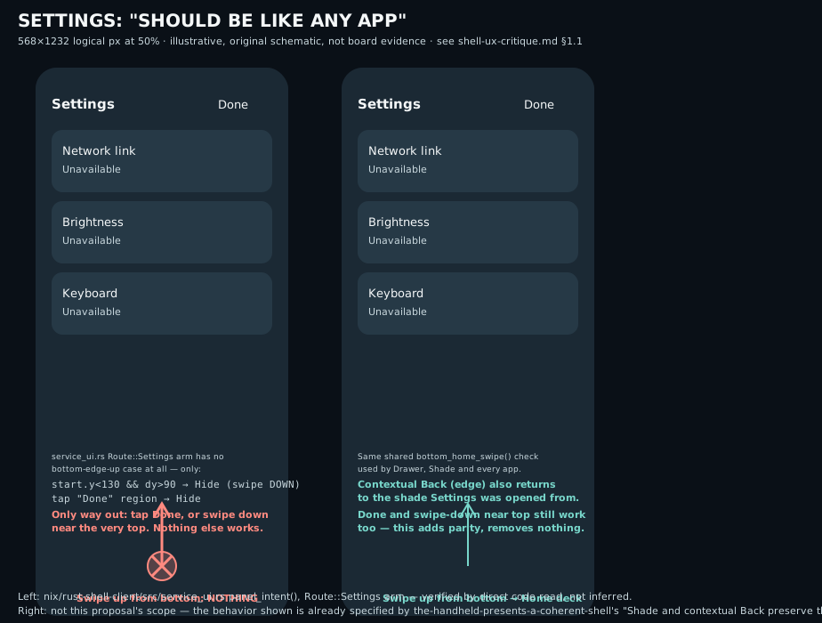
1.1 “Swiping up from the bottom in Settings does nothing” — confirmed, and here is exactly why
This is real, reproducible from the source, and has a precise, single-cause explanation spanning both halves of the shell.
The compositor cedes all touch to the client while any overlay route is
mapped. nix/card-shell/adapter.c:2130-2131:
if (drawer_mapped())
    return false;
This check sits in input_down() before the bottom-edge entry gesture code
(cs_begin_entry/cs_edge_down, lines 2201-2211) is ever reached. Drawer,
Shade, and Settings are three routes painted by one and the same
Wayland layer-shell surface (namespace k230-shell-drawer, matched at
adapter.c:1710, mapped on Layer::Overlay — confirmed by the Rust client’s
own comment at nix/rust-shell-client/src/main.rs:1051, “the settings
overlay … sits on Layer::Overlay, always above every ordinary toplevel”).
drawer_mapped() is true for all three routes alike, so every touch that
isn’t already an active drawer/shade gesture or a blocked contact is handed
straight to the client — the compositor’s own bottom-edge “shrink into the
deck” recognizer never sees it, regardless of where on the screen the touch
starts.
The Rust client, which now owns the touch, has no bottom-edge-swipe-up case
for Settings. nix/rust-shell-client/src/service_ui.rs:321-386
(panel_intent, the Route::Settings arm) recognizes exactly four things:
a downward swipe starting near the top (start.1 < 130.0 && dy > 90.0, line
322 — note this closes Settings on a downward drag, not upward) a tap
on the top-right corner (line 328), taps inside a power-confirmation card
(lines 331-343), and taps on the four capability rows/Wi-Fi/brightness/
keyboard/power controls (lines 345-385). There is no case for an upward drag
starting near the bottom of the screen. A swipe there falls through every
guard and returns None (self.route == Route::Settings branch in
main.rs:2832-2950, particularly the dx.abs() > 18.0 || dy.abs() > 18.0
early return at service_ui.rs:325-326, which rejects it as a “drag,” and no
subsequent branch matches it either). The gesture is swallowed with no
visible response. This is not a timing bug or a hit-box-too-small bug; the
code path for it does not exist.
webOS/M3 comparison. In webOS, the gesture area and its wave/center-button affordance worked identically from any screen — Launcher, Settings-menu overlay, or a full-screen app — because there was exactly one navigation mechanism, not a per-surface one (PCWorld). In Android with gesture navigation, the system back/home gesture is intercepted at the window-manager level before any app or system surface — a Quick Settings panel, a system dialog — gets a chance to consume it differently; Android’s own gesture-compatibility guide exists specifically to police apps that try to special-case edge gestures rather than let every surface honor the same one (Ensure compatibility with gesture navigation). Material 3 Expressive’s predictive-back and recents gestures are, likewise, one system-level mechanism regardless of which surface is showing (9to5Google, Material 3 Expressive redesign). This shell instead has an overlay layer that opts the entire touch surface out of the compositor’s shell gesture the moment it is mapped.
This is already specified, just not implemented. the-handheld-presents-a -coherent-shell’s runtime/handheld-shell-design spec already requires
exactly the fix: “An inward edge Back gesture SHALL dismiss the topmost shell
context in order… The bottom Home gesture SHALL remain the shell escape
while a context is open” (Requirement “Shade and contextual Back preserve the
task,” specs/runtime/handheld-shell-design/spec.md:57-71). The matching
tasks — 2.2 (“Implement qualified side-edge contextual Back for shell
sheet/Settings/shade/drawer/keyboard”) and 4.4 (“Define touch ownership for
bottom Home/drawer, top shade, side Back, keyboard, deck and app content”) —
are both still [ ] open in tasks.md. Priority: P0. Owner: that change’s
tasks 2.2/4.4, not this document. This section exists so whoever picks up
those tasks has the exact bypass (adapter.c:2130-2131) and the exact missing
case (service_ui.rs’s Route::Settings arm) instead of having to
rediscover them.
1.2 “There are no icons on the cards” — confirmed; the “icon” is a letter badge derived from the same broken title
The card switcher does paint something icon-shaped next to each card’s label,
but it is not the app’s icon. nix/card-shell/adapter.c:1187:
char letter = show_icon ? card_badge_letter(display_title) : 0;
display_title is the same raw, unresolved client window title already
documented as wrong in webos-polish-review.md P0-1 (card_display_title,
adapter.c:364-376, a 3-entry allowlist that falls through to the client’s
live title string for everything else — e.g. a terminal card’s badge letter
changes as the shell prompt changes, because the “icon” is a function of
whatever text happens to be in the title bar that frame). card_icon_badge()
(nix/card-shell/render.c:143-175) draws a rounded-square Cairo path filled
with a flat color and one Pango-rendered capital letter — there is no icon
asset, SVG, or .desktop Icon= lookup anywhere in nix/card-shell/*.c
(confirmed: no icon hits besides this badge function and its declaration).
Compare this with the drawer, one file over in the Rust client, which does
correctly resolve real vector icons through the installed icon theme
(nix/rust-shell-client/src/icon.rs, confirmed rendering sharp/unpixelated
in docs/evidence/coherent-shell/rust-icons-host.png, per
webos-polish-review.md P2-2) — the capability to show a real icon already
exists in this codebase, just not on the compositor side that draws cards.
webOS/M3 comparison. webOS cards always paired the app’s manifest icon
with its name in the card header — never the window’s own live content —
because a card’s identity has to survive whatever transient state the
content is in (source needed for §3 of webos-polish-review.md, already
cited there). Android’s recents carousel shows each task’s launcher icon in a
small badge on every card, independent of a screenshot’s content
(9to5Google, Material 3 Expressive redesign
describes the updated recents carousel; the badge-plus-thumbnail pattern
predates M3 Expressive and is unchanged by it).
Already specified, not implemented. runtime/handheld-shell-design’s
“Installed application icons retain identity and privacy” requirement
(spec.md:109-120) already requires the drawer, “eligible card headers,” and
trusted notifications to resolve the real desktop-entry icon with a bounded
cache and a neutral fallback — cards are explicitly in scope, already. Task
1.4 (“Resolve desktop-entry Icon through installed icon themes with fixed
drawer/card/notification sizes…”) is still [ ] open. Priority: P0.
Owner: task 1.4, not this document. The concrete gap this section adds:
task 1.4’s fix needs a resolver reachable from the C compositor (which owns
card_icon_badge), not just the Rust drawer; the two are separate processes
today and neither shares an icon cache with the other, so task 1.4 is not “extend
icon.rs,” it is “build (or share) an icon resolver on both sides of the
Wayland boundary.” That architectural note is not currently written down
anywhere in the-handheld-presents-a-coherent-shell’s design.md decisions
and is worth adding there when task 1.4 is picked up.
1.3 “The card switcher shows one at a time” — mostly confirmed; the actual number is “one full card plus an 8.7%-wide sliver of each neighbor,” which is not the same claim and matters for the fix
This is the one of the three where precision changes the fix. The switcher
(CS_DECK mode) is not literally a single full-bleed card with no
peripheral vision — the layout math already produces a thin peek of the
left/right neighbor — but that peek is far too narrow to serve its purpose.
nix/card-shell-policy/card-shell-policy.c:29-38 (cs_default_config,
called with the real panel dimensions 568×1232):
.card_width=.84*(width-48),          // = .84 * 520 = 436.8 px
.gap=16,
and the deck layout (card-shell-policy.c:192-210, abbreviated):
double pitch=p->config.card_width+p->config.gap;   // = 452.8 px
...
.x=(p->config.width-p->config.card_width)/2+offset*pitch+translation,
For the selected card (offset=0): x = 65.6, spanning to 502.4 — already
inset from both edges by 65.6px. For the right neighbor (offset=1):
x = 518.4, spanning to 955.2 — only 568 - 518.4 = 49.6 of its 436.8px
width is on-screen: 8.7% of one neighboring card, mirrored on the left.
That sliver cannot show an app name, an icon, or recognizable live content —
it is a color swatch at best, not “seeing what’s open.” A person genuinely
cannot tell what else is running without paging through one card at a time,
which is the user’s complaint restated precisely: not “zero peek,” but “peek
too thin to be useful.”
webOS/M3 comparison. webOS’s own card view showed multiple live,
recognizable cards simultaneously with visible gutters between them, not a
one-card-plus-sliver layout — that multi-card legibility is the entire
premise of “see everything open at a glance” that both reviewers (Gruber,
Daring Fireball) and this project’s own docs/design/handheld-shell/README.md
single out as the point of the metaphor
(Daring Fireball, “webOS gestures … proved ahead of its time”).
Android’s Material 3 Expressive recents carousel is explicitly a carousel
of partially-visible cards you can see several of at once, each carrying an
icon badge, with continuous horizontal scroll rather than a
mostly-full-screen single card
(9to5Google, Material 3 Expressive redesign;
Android Authority, Material 3 Expressive deep dive).
Not already specified — this is genuinely new scope. The open
the-handheld-presents-a-coherent-shell requirement covering related ground,
“Bottom app switching follows both touch axes” (spec.md:31-55), governs the
lateral quick-switch drag gesture (“a full or near-full app carousel…
does not first complete entry into the overview”) — that is a deliberate
decision (design.md decision 11) about how switching feels while dragging,
not a claim about how legible the static, released deck overview is. No
open change specifies a minimum neighbor-peek fraction for the idle deck.
This is exactly the kind of P0 this critique’s companion proposal,
openspec/changes/the-shell-behaves-as-one-coherent-system/, turns into a
requirement (see that proposal’s “deck legibility” requirement). Recommended
concrete direction, not yet a commitment: shrink card_width (or grow the
peek independently of card size) enough that a neighbor’s icon badge is
legible — a rough target of showing 20-25% of each neighbor is enough to
read a square icon badge at this panel’s DPI, but the exact fraction needs a
host-rendered comparison, not a guess; see the proposal’s tasks.
2. Navigation model consistency (beyond Settings)
The Settings dead end in §1.1 is not an isolated bug; it is one symptom of a deeper structural fact: this shell has three independent navigation state machines that do not share a gesture vocabulary.
- The C compositor’s card policy (
card-shell-policy.c):CS_NORMAL/CS_DECK/CS_ENTERING/CS_EXPANDING/CS_CLOSING/CS_DRAGGING, with its own bottom-edge-only gesture recognizer (cs_edge_*,cs_entry_*). - The Rust overlay client’s route dispatch (
Route::Drawer/Shade/Settings/Hide,nix/rust-shell-client/src/lib.rs:27-32), which receives rawwl_touchevents oncedrawer_mapped()cedes them, and implements its own, route-specific gesture logic per surface. - The Rust client’s separate Home surface (
Layer::Bottom, always mapped,main.rs:910-912), with its ownhome.down/motion/upinput path (main.rs:2634-2751), entirely disjoint from both of the above.
Each of these three recognizes a different gesture for “leave this surface”:
| Surface | Owning state machine | Dismiss gesture found in code | Direction |
|---|---|---|---|
| App card (deck) | C compositor | Bottom-edge upward drag (cs_edge_down/cs_begin_entry, adapter.c:2201-2211) | up |
| Drawer | Rust DrawerNavigation | Downward drag from the top of the (unscrolled) list, dy > 110.0 (navigation.rs:165-168) | down |
| Shade | Rust panel_intent | Upward drag near the top, dy < -90.0, start.1 < 180.0 (service_ui.rs:279-282) | up |
| Settings | Rust panel_intent | Downward drag near the top, dy > 90.0, start.1 < 130.0 (service_ui.rs:321-324) | down |
| Settings (alternate) | Rust panel_intent | Tap the top-right corner (service_ui.rs:328-330) | tap |
Four surfaces, three different directions, one of them (Settings) reachable
two different ways and one of the four (bottom-edge-up, the one an app
itself uses) reachable from none of the three overlay routes. This is
also not what the open coherent-shell spec asks for: its “Back is contextual
shell navigation” decision (design.md:21) specifies a single side-edge
inward swipe as the one dismiss gesture for “long-press sheet, Settings,
shade, drawer, then keyboard” — none of the three implemented gestures above
is a side-edge swipe; they are three different top-anchored vertical swipes,
each hand-tuned per surface. This is further, sharper evidence for the same
open tasks (2.2/4.4) cited in §1.1 — not a new requirement, but worth
recording here because it shows the inconsistency is systemic (three
separately-invented gestures) rather than a single oversight in Settings.
Priority: P0 (compounds directly with §1.1). Fix: implement the
already-specified single side-edge Back (task 2.2) and route every overlay’s
dismiss through it, retiring the three bespoke top-anchored swipe predicates.
Code: navigation.rs:165-168, service_ui.rs:279-282,
service_ui.rs:321-324, adapter.c:2130-2216.
Dead ends
From three levels deep (Shade → Settings → Wi-Fi → password Entry), there is
no verified route back to Home except tapping back through each level in
turn — wifi_view.page unwinds one page per tap (main.rs:2832-2844), and
Settings itself only closes via the two gestures in the table above. There is
no shortcut equivalent to webOS’s persistent gesture-area center button,
which offered card view from any depth
(PCWorld).
Priority: P1. This is the same root cause as §1.1/§2’s missing bottom-Home
escape (once that lands, a bottom swipe from Wi-Fi Entry would resolve it),
so no separate fix is proposed — it is listed to make the blast radius of
task 2.2/4.4 explicit: fixing “Settings” alone is not enough if Wi-Fi’s own
sub-pages don’t inherit the same escape.
3. The card switcher (additional findings beyond §1.2/§1.3)
Ordering. The deck’s card order comes from whatever order the Sway-side
caller populates p->cards[] in (card-shell-policy.c:125-143 manages
selected index adjustments on insert/remove, but the array’s insertion
order itself is supplied by the caller in adapter.c, which this review did
not fully trace to a recency-of-use or z-order guarantee). This is
UNVERIFIED — flagging it as an open question rather than a finding: webOS
kept cards in a stable, predictable left-right order (not MRU-reordering,
which is itself a notable, deliberate webOS choice — cards don’t jump around
when you switch to one), and this project’s own design.md decision 11 says
“Both routes SHALL use the deck’s stable left/right app order, unchanged by
focus-only switching,” so stability is at least intended. Recommend a task
owner confirm this with a host trace rather than treat it as settled from
this reading.
Close affordance. An upward throw past throw_distance/throw_speed
(cs_default_config, card-shell-policy.c:38) requests a close; this
matches webOS’s flick-to-close and is not a P0/P1 finding on its own. The
gap is discoverability of the gesture (see §8) and legibility once the deck
peek is fixed (§1.3) — a person needs to be able to select a card before they
can flick-close it, and today that means paging through full-card swipes
first.
Empty state. Confirmed present and reasonable: CS_MESSAGE_EMPTY renders
“No running apps” (adapter.c:1239, positioned via status_y at
adapter.c:1283) with the deck’s upward drawer cue still available. No
finding here.
Getting to Home/drawer from the switcher. Per design.md decision 1,
Home (the pinned-icon screen, since superseded by
the-shell-presents-a-pinned-home-screen) is reached by leaving the deck
entirely (a separate Layer::Bottom surface, not part of CS_DECK), and the
drawer is a continued upward pull from the deck (transitions.md). This
matches the user’s mental model reasonably well and is not re-flagged here,
though the drawer-from-deck gesture inherits the same “swipe up” vocabulary
that Settings/Shade don’t honor (§2).
4. Home, drawer, and search
Home is a pinned-icon grid on its own always-mapped Layer::Bottom
surface (home_grid.rs, home_pager.rs, home_state.rs, wired in
main.rs), shipped per the-shell-presents-a-pinned-home-screen. This is a
substantial, already-implemented improvement over the “no home screen at
all” state that proposal itself describes, and this critique has no P0/P1
finding against it from a source read; its own UNVERIFIED markers (real-finger
board acceptance) stand as written in that change.
Drawer layout. Grid, not list: COLUMNS = 3, ROW_HEIGHT = 160.0,
TILE_HEIGHT = 148.0 (nix/rust-shell-client/src/navigation.rs:4-6), with a
tested minimum tile size of 56×56 logical px
(navigation.rs:243, three_columns_hit_only_painted_tiles). Scrolling is
continuous (drag/flick/coast via DrawerNavigation::motion/tick,
navigation.rs:122-205), not paginated. This is a reasonable, already-decent
implementation; visual-gap-audit.md’s P1 finding about the installed
drawer being seven full-width rows describes an older generation, not this
3-column grid (see webos-polish-review.md §0’s chrome-generation
correction for the same kind of generation confusion — worth the same
caution here: confirm which drawer generation any future screenshot shows
before citing it).
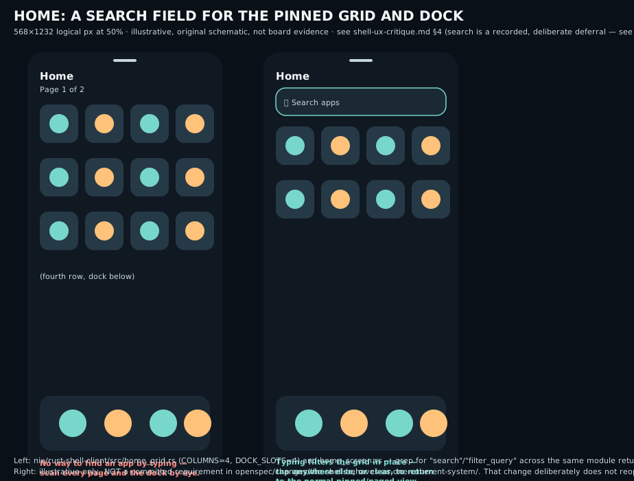
Search: there is none, and that is a recorded decision, not an oversight.
A targeted search of home_grid.rs, home_pager.rs, home_screen.rs, and
catalog.rs for “search,” “filter,” or any text-input concept returns
nothing. This matches the-handheld-presents-a-coherent-shell/design.md
decision 2 verbatim: “Search remains deferred.” This is not a gap this
critique treats as new scope — it is a considered, explicit deferral, and
OpenSpec culture in this repo (see AGENTS.md’s “record what was rejected
and why… expensive to find and cheap to re-enter”) means it should not be
silently reversed by a drive-by proposal. Recommendation, not a
requirement: given the user’s broader dissatisfaction and that this device
already has a functioning on-screen keyboard (making a type-to-filter box
cheap to add once the drawer’s layout is otherwise settled), the coordinator
may want to revisit that specific deferral explicitly — webOS’s TouchPad
generalized exactly this into “Just Type”
(PCWorld TouchPad piece)
and Android’s app drawer has offered type-to-filter search since its
earliest versions. This document flags it; it does not decide it.
Recent apps. No separate “recents” list distinct from the live card deck
was found; the deck itself is the recency-ish surface. Not flagged as a
defect — this mirrors webOS’s single-multitasking-metaphor philosophy
deliberately (design.md’s own framing), and Android’s separate recents
screen is not a fit for a device this size without also solving §1.3’s
legibility problem first.
5. Notifications and shade
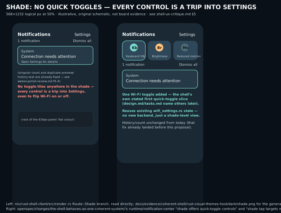
No quick-toggle tiles in the shade — genuinely new scope. The shade
(Route::Shade’s panel_intent, service_ui.rs:279-320) recognizes exactly:
scroll, a per-notification action tap, OpenSettings, NotificationDismissAll,
and the swipe-to-close from §2. Brightness (ServiceRequest::Brightness) and
keyboard toggle (ServiceRequest::KeyboardToggle) exist only inside
Route::Settings (service_ui.rs:353-370) — one full navigation hop away
from the shade, with no shortcut. Neither Android’s Quick Settings grid nor
webOS’s tap-the-status-bar semitransparent Wi-Fi/Bluetooth/Airplane menu
requires leaving the notification-adjacent surface for the handful of
highest-frequency toggles
(GSMArena, Palm Pre review;
Android Quick Settings is a standard part of the gesture-navigation shade,
Material 3 Expressive redesign coverage).
Priority: P1. Not owned by any open change (confirmed: no hit for
“quick toggle”/“Quick Settings” anywhere in openspec/changes/*/design.md
or proposal.md). This is one of the three requirements in the companion
proposal.
Dismiss-all exists, per-item dismiss exists (side-swipe,
notification_swipe_release, service_ui.rs), grouping does not. The
notification list is a flat chronological sequence
(ServiceView.notifications.events, service_data.rs) with no per-source
grouping. Android groups notifications by app in a collapsible stack; this is
a real gap but P2, not P0/P1 — this device’s expected notification volume
(a personal handheld with a bounded set of installed apps, no third-party app
store) makes grouping lower-leverage than the quick-toggle gap above.
The singular/plural bug is still present, unresolved. Confirmed by direct
read, not re-derived: render.rs:1844, format!("{count} notifications") —
literally “1 notifications” for a single event. Already flagged as part of
webos-polish-review.md P1-4; cited here only to confirm it survives in the
current tree and to note it is a one-line fix independent of that finding’s
larger preview/history-redundancy point.
6. Motion
Cross-reference webos-polish-review.md’s P1-1 (font inconsistency) and
visual-gap-audit.md’s P2 motion note (real-finger report of “abrupt app
zoom-out and mechanical release”) rather than re-deriving them. One
additional, source-grounded finding neither document makes:
Card-entry/expand motion is a fixed-duration linear ramp, not spring
physics, contradicting both the webOS precedent and this project’s own
stated non-goal against it. card-shell-policy.c:499-508 (cs_tick,
CS_EXPANDING mode):
double duration=p->config.reduced_motion ? 60 : 160;
...
p->expand_progress=fmin(1,elapsed/duration);
This is elapsed / duration clamped to 1 — a straight linear interpolation
over a fixed 160ms (or 60ms reduced-motion) window, with no easing curve,
spring, or velocity carry-in from the gesture that triggered it. This
specific transition (card expand/collapse) is distinct from the entry-drag
tracking (cs_entry_motion) and release-settle
(cs_entry_up_at/entry_release_velocity) paths, which do carry release
velocity into a spring-like decel (card-shell-policy.c:589-609,
699-739) — so the codebase already has two different motion models
side by side: physically-continuous drag/release for the two-axis
quick-switch, and a flat linear timer for plain expand/collapse. Material 3
Expressive’s defining motion change is explicitly a physics-based
“spatial springs” system replacing fixed-duration easing curves precisely
because linear/eased timers “can feel mechanical”
(9to5Google, Material 3 Expressive redesign).
webOS’s own documented card behavior — “a card follows a held drag and can be
thrown upward to close” — is continuous-motion-out even without a named
physics model. Priority: P1. Fix: carry the entry/release velocity
model already implemented for cs_entry_* into CS_EXPANDING’s tick
function instead of the separate fixed-duration ramp, so tap-to-expand feels
like the same physical system as the drag gestures rather than a distinct,
timer-driven animation. Code: card-shell-policy.c:493-522 (linear),
compare card-shell-policy.c:670-740 (velocity-aware) for the pattern to
reuse.
7. Visual hierarchy, typography, colour, shape, iconography, touch targets
Fully covered by webos-polish-review.md (P0-2 dead panel space, P0-4
uneven Settings spacing, P1-1 font inconsistency, P1-3 preview fallback
treatment, P2-1 radius drift, P2-2 icon rendering confirmed fine) and
visual-gap-audit.md (drawer density, shade hierarchy). Not re-derived here.
One addition:
Touch targets are asserted at 56 logical px by this project’s own design
doc, but that number has never been checked against Material’s 48dp
guideline at this panel’s actual density. runtime/handheld-shell-design’s
“Shared portrait shell language” requirement already sets “at least 56 such
[logical] pixels tall” as the shell’s own bar
(spec.md:9) — comfortably above Material’s minimum recommendation of
48×48dp, “a physical size of about 9mm regardless of screen size”
(Material Design 3, Accessibility designing).
But “56 logical pixels” and “48dp” are only the same physical size if the
panel’s actual pixels-per-inch is known and the shell’s logical-to-physical
scale is 1:1, which runtime/shell’s CPU-rendering requirement confirms it
is (“the current output scale of 1, one logical pixel equals one panel
pixel,” restated at handheld-shell-design/spec.md:9) — but no committed
document in this repo states the RM69A10’s actual PPI or does the
9mm-physical-size arithmetic to confirm 56px clears the bar rather than
merely asserting a round number. Priority: P2 (documentation gap, not a
code defect) — cited here so a task owner closing 1.5/5.x physical
acceptance tasks computes and records the actual mm figure once, rather than
trusting the 56px constant by inspection.
8. Feedback: pressed states, loading, errors, no haptics
Pressed-state feedback exists — inconsistently. The drawer
(DrawerNavigation::pressed, navigation.rs:211-221, wired to
renderer.set_drawer_pressed in main.rs:2643-2651), Home grid
(home.pressed(...), main.rs:2429), and both theme/background carousels
(sync_theme_pressed/sync_background_pressed, throughout main.rs) all
give an immediate visual highlight on touch-down, held only while the finger
stays on the same tile — a reasonable state-layer equivalent to Material’s
ripple/state-layer convention
(Material 3 ripple support notes).
Settings’ own capability rows and Power cards have no equivalent. A
targeted search of the Route::Settings rendering path
(render.rs:1519-1660, settings_row_y/settings_layout/settings_confirm_layout)
finds no pressed state anywhere in that block, and panel_intent’s
Route::Settings arm (service_ui.rs:321-386) only ever fires on release
— a tap on Wi-Fi, Brightness, Keyboard, Reboot, or Power off gives the user
zero visual acknowledgement until the resulting screen change actually
lands. Combined with §11’s unmeasured redraw cost on this “one slow core”
board, a tap with no immediate feedback and an uncertain-latency screen
change is the worst combination available — precisely the situation instant
press feedback exists to prevent. runtime/handheld-shell-design’s “Surfaces
explain their state” requirement already requires “Focus and pressed states
SHALL have a non-color cue” (spec.md:121-123) as a cross-surface
requirement — this is a further, concrete data point that the current
Settings implementation does not meet it, filed against that existing
requirement rather than as new scope. Priority: P1. Code:
render.rs:1519-1660 lacks what navigation.rs:211-221 already
demonstrates as the pattern to copy.
No haptics — by hardware, confirmed, not revisited here.
docs/design/handheld-shell/motion-research.md already documents a
schematic-text search of the vendor board finding no motor/vibration/haptic
identifier, and states plainly “no vibration work is planned for the current
board.” Given that, and given §8’s finding above, visual feedback is not
optional polish on this device — it is the only feedback channel a person
gets, which raises the priority of fixing Settings’ missing pressed state
specifically (already reflected as P1 above) beyond what it would be on a
device with a fallback haptic buzz.
9. Discoverability
The gesture hints that do exist are permanent on-screen text on every visit
(webos-polish-review.md P1-2 documents three inconsistent styles for this
across the drawer footer, shade subheading, and deck footer) — this
contradicts the user’s own prior, already-recorded rejection of permanent
chrome (webos-polish-review.md §0’s history of the rejected persistent
Apps/Windows/Back/Home bar) in spirit, even though these are hint strings
rather than buttons. This project’s own motion-research.md already
proposed the fix — “consider showing each hint only until its gesture has
been performed once (a small persisted flag)” — but a targeted search finds
no persisted first-use flag anywhere in nix/rust-shell-client/src/ or
nix/card-shell/. This is the same finding as P1-2, re-filed as “the
project’s own proposed fix for P1-2 is still unimplemented,” not a new
finding — no new priority assigned beyond P1-2’s existing P1.
10. Keyboard interplay, text entry, accessibility
Keyboard/gesture conflict arbitration exists and looks reasonably
considered. adapter.c:2106-2111: keyboard_gestures_enabled() intercepts
touch before drawer/shade dispatch, and kg_down is passed
launcher_mapped() || drawer_mapped() || popup_at(x, y) as an explicit
conflict signal. This is a real, code-level attempt at exactly the
arbitration the-keyboard-follows-touch-gestures change specifies. Whether
it feels right (the escape-while-typing case) remains an explicit
UNVERIFIED real-finger gate in that change’s own tasks — not re-litigated
here.
Accessibility beyond motion reduction: effectively absent, and this is
different from the already-planned “accessibility aid.” A search across
nix/rust-shell-client/src/*.rs for “accessib,” “a11y,” “contrast,”
“large_text,” or “screen reader” returns only reduced_motion — a single
boolean env var (K230_SETTINGS_REDUCED_MOTION, main.rs:3344-3345) that
shortens animation durations. the-handheld-presents-a-coherent-shell
already plans an “accessibility aid” (design.md decision 2, task 1.5) —
but that aid is specifically “large labeled route controls” for
gesture discoverability (a big-button alternative to swipes), not a vision
accommodation like adjustable text size or a high-contrast palette variant.
Those are a different axis of accessibility entirely and nothing in any open
change currently covers them. Priority: P1. Genuinely new scope — the
second of the three requirements in the companion proposal.
11. Performance-perceived UX on this slow CPU
What is actually measured and committed: docs/evidence/shell-performance.txt
records Sway/Pixman output-commit latency for a terminal-scrolling-plus-
visible-keyboard workload only — median 14.0ms, p95 15.6ms, p99 22.7ms
over 254 commits, explicitly caveated “these durations do not imply an FPS,
physical refresh, or touch-latency result.” docs/evidence/card-composition-board/ card-board-first-pass-telemetry.txt records CPU-time and RSS samples for an
opt-in card-composition trial, not frame latency.
Nothing is committed for card-switcher drag latency, drawer flick-scroll
cost, or Settings panel transition cost — the exact interactions this
critique is about. This matters more here than it would elsewhere: Material 3
Expressive’s spring-based motion model assumes near-60fps responsiveness to
feel “alive” rather than laggy
(9to5Google, Material 3 Expressive redesign),
and this device has one slow CPU core doing CPU rasterization with no GPU
path (runtime/shell’s own “renders on the CPU” requirement,
openspec/specs/runtime/shell/spec.md:83-121). Recommending motion polish
(§6’s spring-physics fix, or the deck-density change in §1.3, which repaints
more of the screen every frame) without first knowing whether this board can
sustain it at interactive rates risks prescribing a fix that makes the felt
experience worse, not better. the-handheld-presents-a-coherent-shell’s task
4.5 (“touch→scene damage/commit→frame-done→output-presented trace IDs…
declared board p95/p99 budgets”) already exists to close exactly this gap for
the coordinated compositor scene — still open. Priority: P1 process
finding, not a new requirement — recommend task 4.5 be run (or a narrow
subset of it) before committing to any motion-heavy fix from this document,
including the ones in §1.3 and §6.
12. Top findings, ranked
| # | Finding | Screen | Priority | Owner |
|---|---|---|---|---|
| 1 | Bottom-edge swipe-up does nothing on Settings/Drawer/Shade (compositor cedes touch via drawer_mapped(), and the Rust client has no matching case) | Settings (user’s example) | P0 | the-handheld-presents-a-coherent-shell tasks 2.2/4.4 (open) |
| 2 | Card switcher “icon” is a single-letter badge derived from the same broken raw window title, not a real app icon | Card switcher (user’s example) | P0 | the-handheld-presents-a-coherent-shell task 1.4 (open); needs a compositor-side resolver, currently undesigned |
| 3 | Deck neighbor peek is ~8.7% of a card width — present, but too thin to identify what else is open | Card switcher (user’s example) | P0 | New — the-shell-behaves-as-one-coherent-system |
| 4 | Three different, direction-inconsistent overlay-dismiss gestures (Drawer down, Shade up, Settings down) instead of one shell Back | Drawer/Shade/Settings | P0 | the-handheld-presents-a-coherent-shell tasks 2.2/4.4 (open), same root cause as #1 |
| 5 | Card header shows the raw, live-changing window title instead of the app’s name | Card switcher | P0 (already filed as webos-polish-review.md P0-1) | that document |
| 6 | Secondary panels fill the full screen regardless of content, large dead voids | Settings/Themes/Wi-Fi/Shade | P0 (already filed as webos-polish-review.md P0-2) | that document |
| 7 | Settings capability rows have no pressed/touch feedback at all, unlike every other tappable surface in the shell | Settings | P1 | New evidence against handheld-shell-design’s existing “Surfaces explain their state” requirement |
| 8 | No quick-toggle tiles in the shade; brightness/keyboard toggle require a full hop into Settings | Notification shade | P1 | New — the-shell-behaves-as-one-coherent-system |
| 9 | No vision-accessibility option (text size / high contrast) beyond a binary reduced-motion flag | Settings/global | P1 | New — the-shell-behaves-as-one-coherent-system |
| 10 | Card expand/collapse motion is a fixed-duration linear ramp; drag/release elsewhere already has velocity-aware spring-like settle | Card expand/collapse | P1 | New — recommend as a task, not a new requirement |
| 11 | No committed frame-latency measurement for card-switcher/drawer/Settings transitions, only for terminal scrolling | All gesture surfaces | P1 | the-handheld-presents-a-coherent-shell task 4.5 (open) |
| 12 | Gesture hint text is permanent chrome on every visit; the project’s own proposed “show once” fix is unimplemented | Drawer/Shade/Deck footers | P1 (already filed as webos-polish-review.md P1-2) | that document |
| 13 | Two renderers (C deck, Rust overlay) with two independent, unpinned font declarations | Deck vs. Drawer/Shade/Settings | P1 (already filed as webos-polish-review.md P1-1) | that document |
| 14 | Dead ends three levels deep (Wi-Fi password entry) with no shortcut back to Home | Settings → Wi-Fi → Entry | P1 | Same root cause as #1/#4 |
| 15 | Notification count string is ungrammatical for the singular case (“1 notifications”) | Shade | P2 (already filed as webos-polish-review.md P1-4) | that document |
13. Reference material used
Primary sources for webOS and Material 3 Expressive, beyond what
webos-polish-review.md and this project’s own docs/design/handheld-shell/
already cite (not repeated where identical):
- Ensure compatibility with gesture navigation — Android Developers
- Add support for the predictive back gesture — Android Developers
- Material 3 Expressive redesign — 9to5Google, 13 May 2025
- Material 3 Expressive deep dive — Android Authority
- Accessibility designing — structure, touch targets — Material Design 3
- Material Design 3 in Compose (ripple/state-layer notes) — Android Developers
- Up close with HP’s TouchPad and webOS (“Just Type”) — PCWorld
- webOS gestures “proved ahead of its time” — Daring Fireball, 2017
- Palm Pre review, status bar quick menu — GSMArena
No screenshot or image from any of these sources is reproduced in this
repository; only qualitative behavior and directly quoted/cited text are
used, consistent with webos-polish-review.md’s own sourcing discipline.
14. Mockups
Three original, schematic SVGs illustrate the switcher and Settings findings
side by side with a proposed direction. They are illustrative only — not
board evidence, not exact wireframes of the spec text in
openspec/changes/the-shell-behaves-as-one-coherent-system/, and each says
so in its own caption:
-
shell-ux-critique-switcher.svg— §1.3’s current ~8.7%-peek deck next to one illustrative richer option (a distinct multi-up grid). The proposal’s actual, bounded requirement is narrower — widen the existing deck’s peek — with the grid mode recorded as a considered-and-set-aside alternative in that change’sdesign.md. -
shell-ux-critique-navigation.svg— §1.1’s Settings swipe-up dead end next to the already-specified fix (not this proposal’s scope; shown for context). -
shell-ux-critique-shade.svg— §5’s missing shade quick toggles, plus (not this proposal’s scope, shown for context) the already-filed duplicate-preview and singular/plural fixes fromwebos-polish-review.mdP1-4. -
shell-ux-critique-home.svg— §4 found no P0/P1 finding against the shipped pinned-icon Home itself; this mockup instead illustrates, purely as an option, what a type-to-filter search field on Home/drawer could look like. It is not a proposed requirement: §4 and the companion proposal deliberately decline to reopen the recorded “search remains deferred” decision without explicit authorization, and the mockup’s own caption says so.
15. What still needs the board
Every finding above is a direct source or committed-evidence read; none requires the board to confirm the code says what this document says it says. What remains genuinely unverified and needs real glass, listed so a future capture doesn’t have to re-derive the mapping:
| Finding | Decidable from source alone | Needs board/glass |
|---|---|---|
| §1.1 Settings swipe-up dead end | yes — the missing code path is provable by reading | confirming the fix (once implemented) is discoverable without a hint the first time |
| §1.2 Card icon is a letter badge | yes | legibility of a real icon at this size once implemented |
| §1.3 Deck peek too thin | yes — the arithmetic is exact | choosing the actual target peek fraction needs a host-rendered comparison at minimum, ideally an on-glass legibility check |
| §2 Three inconsistent dismiss gestures | yes | none beyond normal visual/gesture review once unified |
| §5 No shade quick toggles | yes (absence is a grep) | none — this is a net-new feature, no regression to check |
| §6 Linear vs. spring expand motion | yes — direct code contrast | whether the reused velocity-aware model actually feels better requires a real-finger pass, per the-handheld-presents-a-coherent-shell task 5.2 |
| §8 Settings rows have no pressed state | yes | none beyond normal visual review once added |
| §10 Accessibility gap | yes (absence is a grep) | choosing target text scale/contrast values benefits from a low-vision reviewer, not assumed from this document |
| §11 No switcher/drawer/Settings frame-timing evidence | yes — the evidence directory contents are directly inspectable | the measurement itself is on-glass by definition; this is exactly what task 4.5 exists to produce |
None of the above claims a physical/optical/real-finger pass. Per AGENTS.md,
any implementation that follows from this document needs its own named
evidence class recorded against the task that implements it.